Dico
App
Overview
PRODUCT
Dico is an app that delivers quick focused language lessons and customized vocabulary upload. Users can also connect with other learners, track progress against learning goals, and set study reminder notifications.
TEAM
This project was completed as part of the CareerFoundry Intro to UX Design course. I collaborated with instructors and other students for design feedback and for the user research portion of the project.
ROLE
UX Research, UX/UI Design, Usability Testing
TOOLS
Figma, Lucidchart, Marvel
TIMELINE
May - July 2022
Context
Leveling up foreign language skills
While more than half of Europeans are bilingual, less than twenty percent of Americans can speak another language fluently according to a recent survey. Roughly one in five also report a missed career opportunity because they didn’t know a second language. In this steadily globalizing world, foreign language skills can provide a competitive edge in the labor market.
Challenge: How might we provide users with a way to learn a foreign language that is focused, engaging, and empowers them to meet career and life goals?
Process
Research
Market opportunity for lessons coupled with customized vocab
I looked at three current language and vocabulary learning apps (Duolingo, Babbel and Quizlet) to understand what is currently working well and what isn’t working well in the language app market.
Although there are many similar features across these apps, I noticed that Duolingo and Babbel were both missing the ability to upload one’s own study words. While flashcard app Quizlet did provide customized word upload, it did not provide any curated lessons, leaving all study content up to the user. I thought users might benefit from the short entertaining lessons of Duolingo and Babbel, combined with the word customization of Quizlet so that they could tailor their language study to their career and life goals.
COMPETITIVE ANALYSIS
But what do users say they want?
Before moving forward, I wanted to verify whether language app users really wanted both of these features in an app. So I conducted user interviews with three recent users of current language/vocabulary learning apps to get in depth qualitative information about their desires, behavior patterns, and opinions. I learned:
Short lessons are preferred.
Learning with others is motivating.
Work specific vocab is necessary.
Tracking accomplishment is a good incentive.
IN DEPTH INTERVIEWS
Ideate
Addressing the known goals
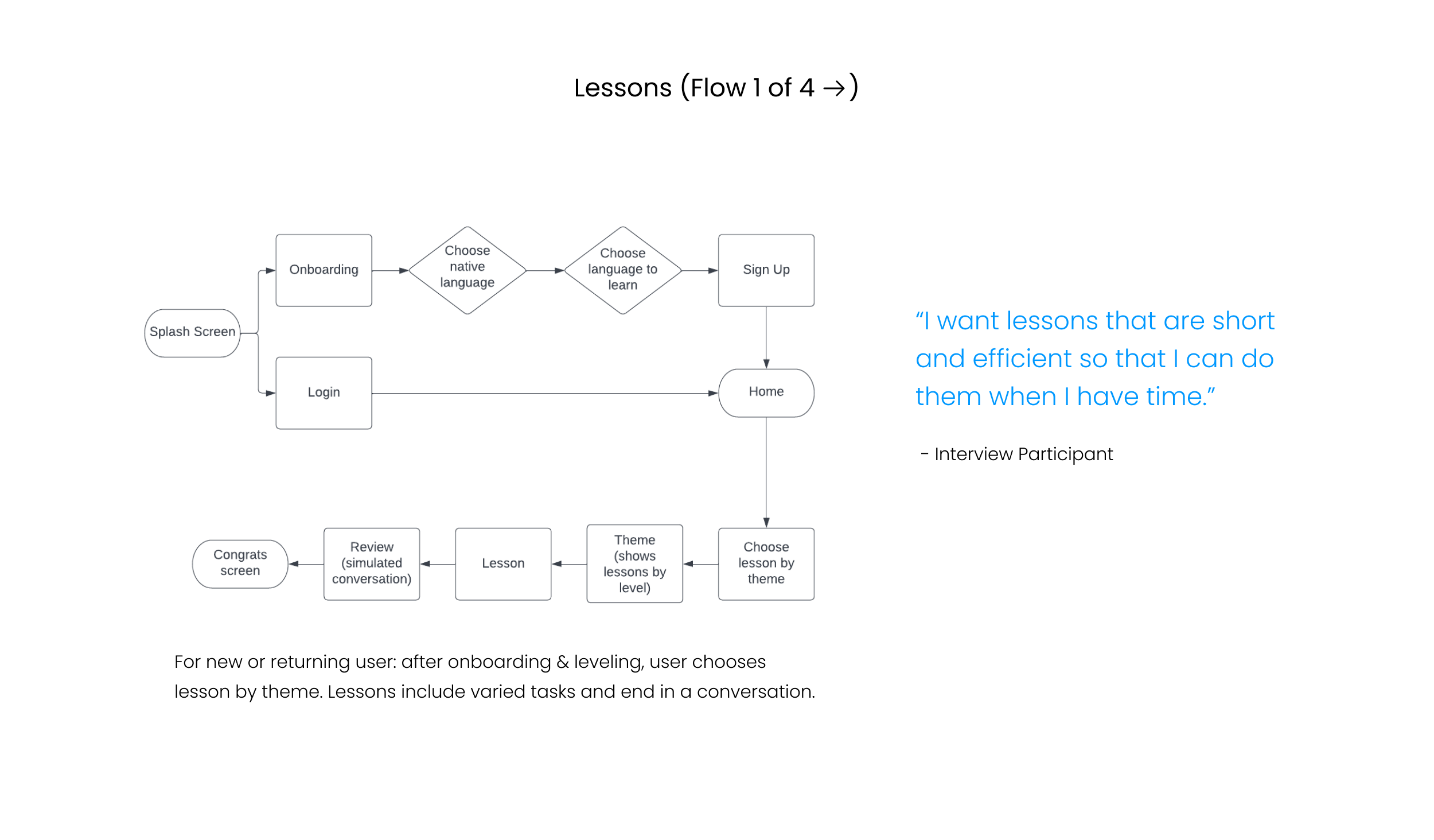
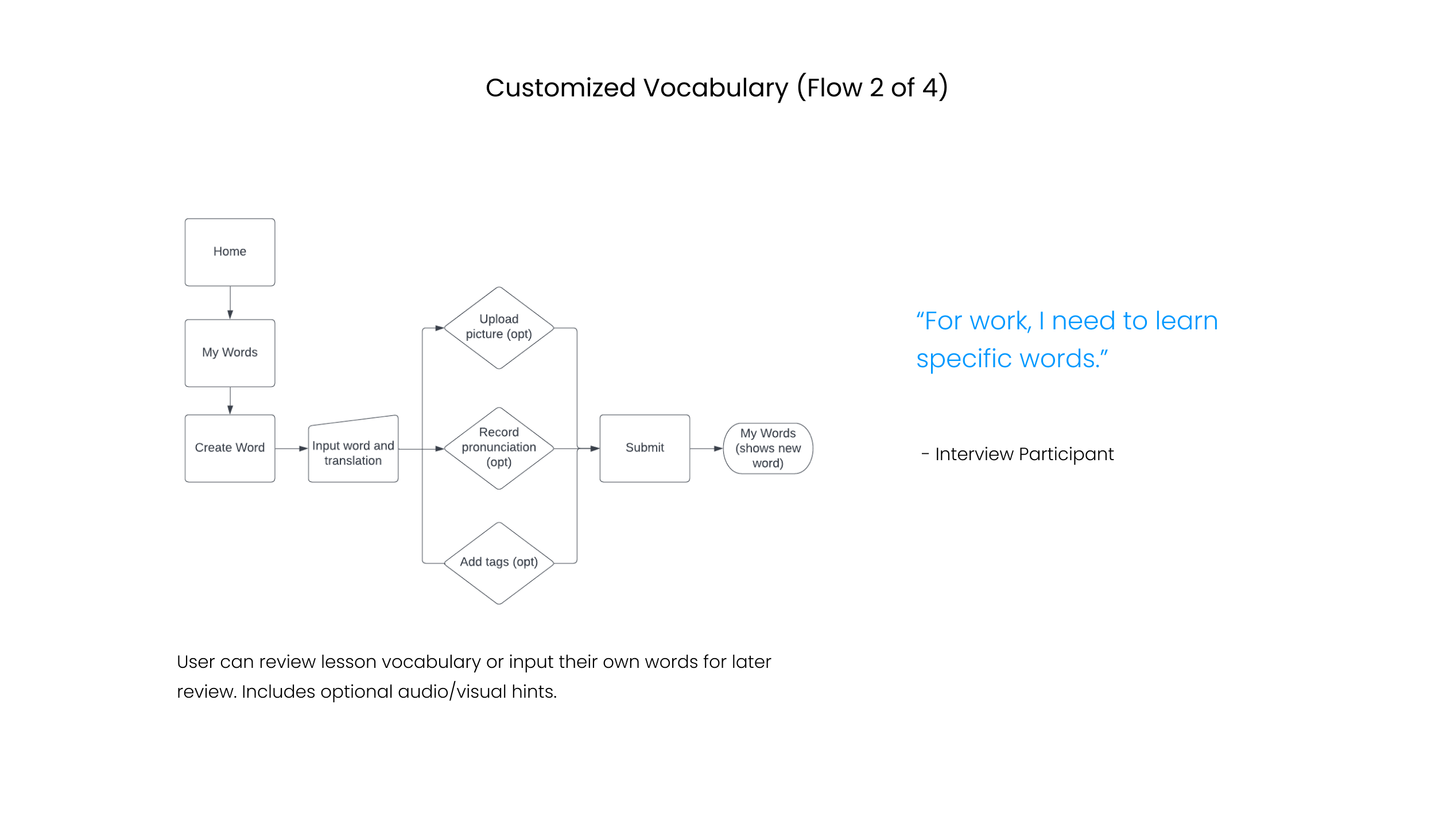
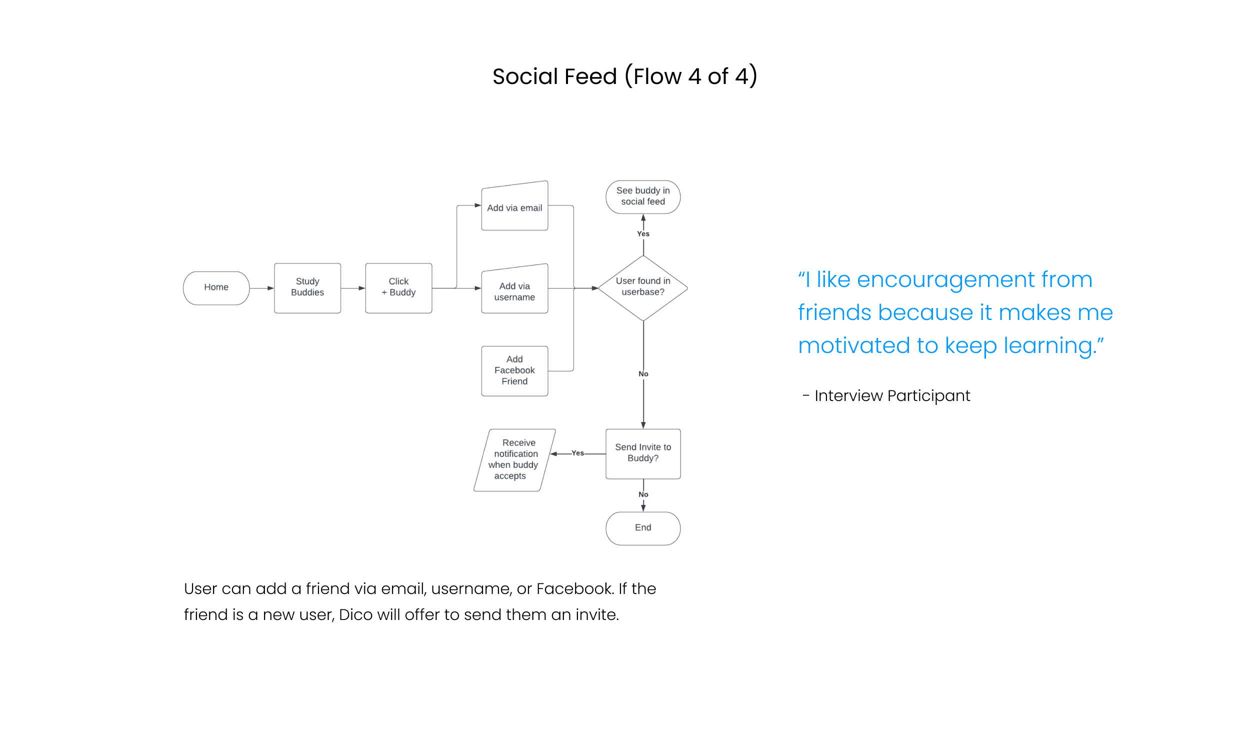
Now that I understood the goals of my typical user, I started imagining how they might go about accomplishing those goals within my app. I created user flows for these key features suggested by my research: curated lessons, customized vocabulary, progress tracking, and social feed.
Mid-Fidelity Design
A testable prototype for the major flows
Using Figma, I created mid fidelity wireframes for each of my app’s major flows. I included copy in my screens that would allow a potential user to understand how the app works in preparation for usability testing, and created a testable online prototype.
-
Lessons
Lesson plan suggested for self reported knowledge level. User picks lesson by theme. (Wireframes include key task examples but actual lessons include several tasks types.)

-
Vocabulary Review & Upload
From “My Vocab” screen, user can review words from completed lessons. They can also add and review any of their own customized vocabulary words.

-
Progress Tracking
User can set their own goals for study pace (sessions per week). They can also set time-based goals for each study session. Once set, the app tracks progress against goals.

-
Social Feed
User can find a “study buddy” by username, email address, or Facebook friend list. They can also set notifications preferences for social feed updates.

Usability Testing
Issues found with account creation and vocab upload
I conducted three moderated usability test sessions of my digital prototype with potential users (both remote and in-person). Users were prompted with a short set of tasks to test major functionality.
For the most part, feedback about the app was positive. However, users experienced confusion in some places that were critical enough to the main objectives of the app that updates were necessary.
METHODOLOGY & RESULTS
Iterate
Account and upload solutions
After viewing user’s frustration with some of my app’s key features, I made some updates to address the key issues: account creation, word upload, pronunciation upload, and buddy connection.
High Fidelity Mockups
Clean, bright, and minimal UI
Using Figma, I transformed my mid-fidelity prototype into high-fidelity mockups. My mockups included the improvements I gathered from my round of usability testing and also added finishing touches like color and images. Because I knew that the UI would include several images for lesson functionality, I wanted to keep the other screen elements like text and iconography clean and minimal.
ONBOARDING
LESSONS
VOCABULARY REVIEW & UPLOAD
PROGRESS TRACKING
SOCIAL FEED
Lessons Learned
This project challenged me to think strategically and holistically. As I went from research to ideation, to design, and then on to testing and iterating, I understood how each phase cumulatively contributed to the end result. I saw the design experience as a journey, each stop on the path leading to the next and eventually forming a cohesive story. A couple key takeaways were:
Don’t limit yourself to testing only the people that match your target audience. I included one person in usability testing who had never used a language learning app before. She brought a fresh perspective and clued me in to some parts of the app that were causing obvious confusion.
During the prototyping process, focus less on perfection and more on gathering the right insight to move forward. In my initial iteration, I learned it was more beneficial to start with just the screens I needed in order to test my key features, rather than produce an exhaustive collection of screens.
Next Steps
There is a bit more to explore with Dico. Because users reported being motivated by progress rewards, I would also like to explore further reward features to excite and motivate users to continue learning. I would also like to conduct another round of usability testing on my improved designs to validate my solutions as well as get user feedback on my UI style choices.
Need a UX designer?


