Maker Feed
App
Overview
PRODUCT
MakerFeed is a responsive web app that connects film and performing arts students with other students in order to promote peer-to-peer learning, project feedback, community support, and study motivation. View clickable prototype.
TEAM
This project was completed as part of the CareerFoundry UI for UX Designers course. I collaborated with my course provided industry mentor for design critique and feedback.
ROLE
UX/UI Design
TOOLS
Figma, Drawio
TIMELINE
February - April 2023
Context
Enhancing learning for performing arts students
Pursuing a degree in film or performing arts can be challenging and competitive. But these fields are often collaborative by nature, and having a community of peers who understand the unique demands of the industry can facilitate student cooperation and enhance learning.
Challenge: How might we help film and performing arts students connect with eachother so they can share ideas, get feedback, and create high-quality work together?
Empathize
Our app’s typical user
The project brief provided me with a user persona that gave me useful insight into the app’s intended user and their goals and desired actions, a busy student who wants to connect with others for feedback and support.
Ideate
User stories and flows for main features
I knew that my persona wanted to connect with like-minded students to share his work and collaborate. I envisioned providing him with a way to search for other students with similar interests, to share his own work in progress, and to message other students with ideas.
Mid Fidelity Wireframes
A mobile first approach for key functionality
I used a mobile-first approach to create wireframes for the web app’s major flows in order to establish a foundation for the design that prioritized the most important screen content. I also wanted to ensure that the app was optimized for a user base who would often access it on the go via mobile device.
Create a profile to tell your story
Provide students with a way to create a personal profile to let other students know about their interests, passions, and background. (Profile creation upon sign up is optional and can be completed later if desired.)
THE APPROACH
Connect with other students and ask for feedback on course projects
Allow students to search for other students by name or for content posted by others by topical keyword. Give them a way to post their own project work for peer feedback or pose questions to the community.
THE APPROACH
Message others to collaborate on projects
Give students the option to message each other directly to discuss the details of projects or arrange collaboration sessions.
THE APPROACH
Breakpoints and mid fidelity responsive designs
After designing mobile wireframes for my major flows, I moved on to tablet and desktop breakpoints. Here in the home screen, the bottom navigation bar in the mobile design becomes a left navigation menu within the tablet and desktop breakpoints. The increased width in the desktop breakpoint allows for a right hand panel suggesting search and people recommendations.
HOME PAGE
The Visual Approach
Inspired by collaboration & movement
For my mood board, I took inspiration from the social aspects of my persona’s goals. Film and performing arts are a collaborative and creative subject, and I chose images and other elements that conveyed a dynamic energy, alluding to the movement of performance. I also explored two color scheme options.
Mood board
Color scheme options
ORIGINAL OPTION: DARK THEME
In my mood board, the colors were a nod to a film strip. But I realized that my app UI would need a scheme that allowed for readability of the content. I explored this dark theme that reminded me of a darkened movie theater. But I thought that the dark background with bright saturated elements might be hard on the eyes at larger screen sizes.
CHOSEN OPTION: MINIMAL LIGHT THEME
I knew the images in this app would come from users themselves when they uploaded video/photo content or profile pics. So I chose this option that injects color sparingly with bright elements, but that won’t distract from user’s own images.
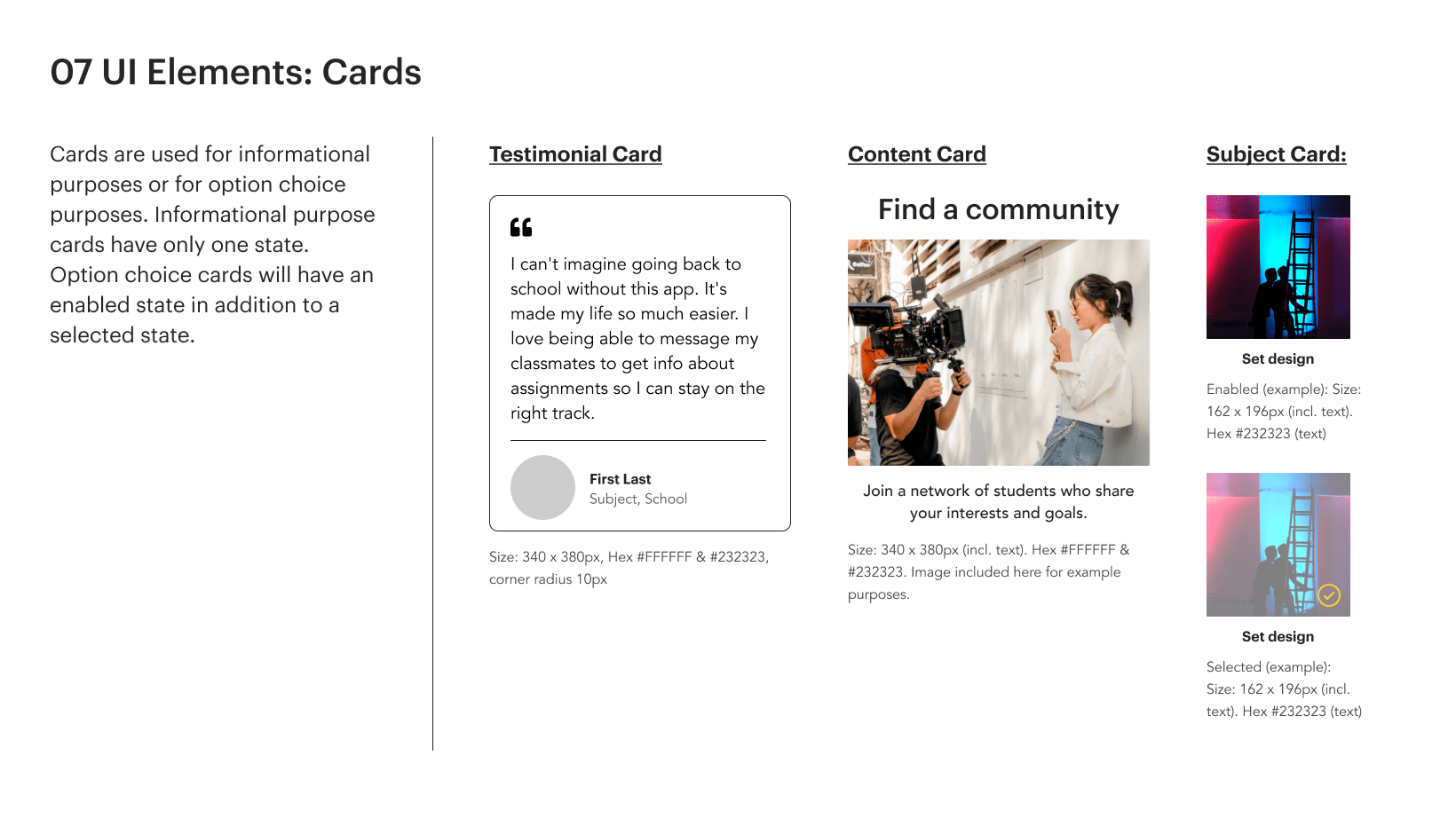
Style Guide
High Fidelity Design
MOBILE BREAKPOINT:
MOCKUPS FOR MULTIPLE BREAKPOINTS:
Lessons Learned
This project taught me to balance allowing myself the creative freedom to explore different visual directions while also adhering to a structured approach with clear phases. It was helpful to see the plan ahead so that I could timebox each step along the way. I could also envision how my decisions in one phase might affect the possibilities in a later phase. As I went from understanding my user and their goals, to brainstorming the aesthetic direction, and finally to creating the responsive design, I felt supported by a framework while also being able to explore possibilities when desired.
Need a UX designer?


