Tiny Pad Coach
App
Overview
PRODUCT
Tiny Pad Coach is a responsive web app that connects those interested in tiny home projects with reliable experts in tiny home building. Users can search for an expert by structure type and building stage, send them a quick message, or book a longer video call to get answers to tiny build questions.
TEAM
This project was completed as part of the CareerFoundry UX Immersion course. I collaborated with instructors and other students for design feedback.
ROLE
UX Research, UX/UI Design, Usability Testing
TOOLS
Figma, Lucidchart, Optimal Workshop
Context
A growing movement with disparate resources
Tiny home living is a growing global trend that appeals to those interested in leaving a smaller ecological footprint and having the financial freedom to focus on experiences, rather than things.
“Tiny home” covers everything from van conversions to foundation-built structures, making each project unique and often unsupported by traditional builders. DIYers share their insights online, but sifting through endless blogs and videos can make finding specific answers overwhelming.
Challenge: how might we provide those interested in tiny home living with quick, reliable answers to their specific tiny home questions?
The Solution
A quick peek at what the app offers
Tiny pad coach connects users with questions about tiny home building with vetted experts. Users can search for a tiny home expert within several categories, and connect with them via in-app messaging and video call features.
Find an expert
Search for a tiny home expert to answer your specific tiny home project questions by browsing popular categories or searching by structure type, building phase, and rate.
Vet their experience
“Meet” your expert by watching a short introduction video or read more about their tiny home project experience in their bio.
Connect
Send your expert a message to ask a quick question or schedule a video call with them to get in depth advice.
How We Got There
Research
Engaged audience with few dedicated apps
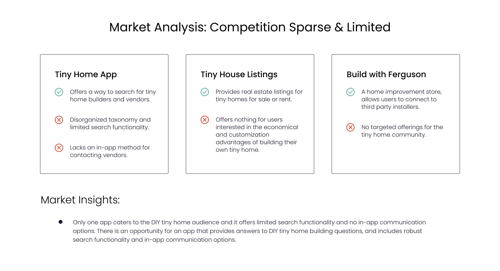
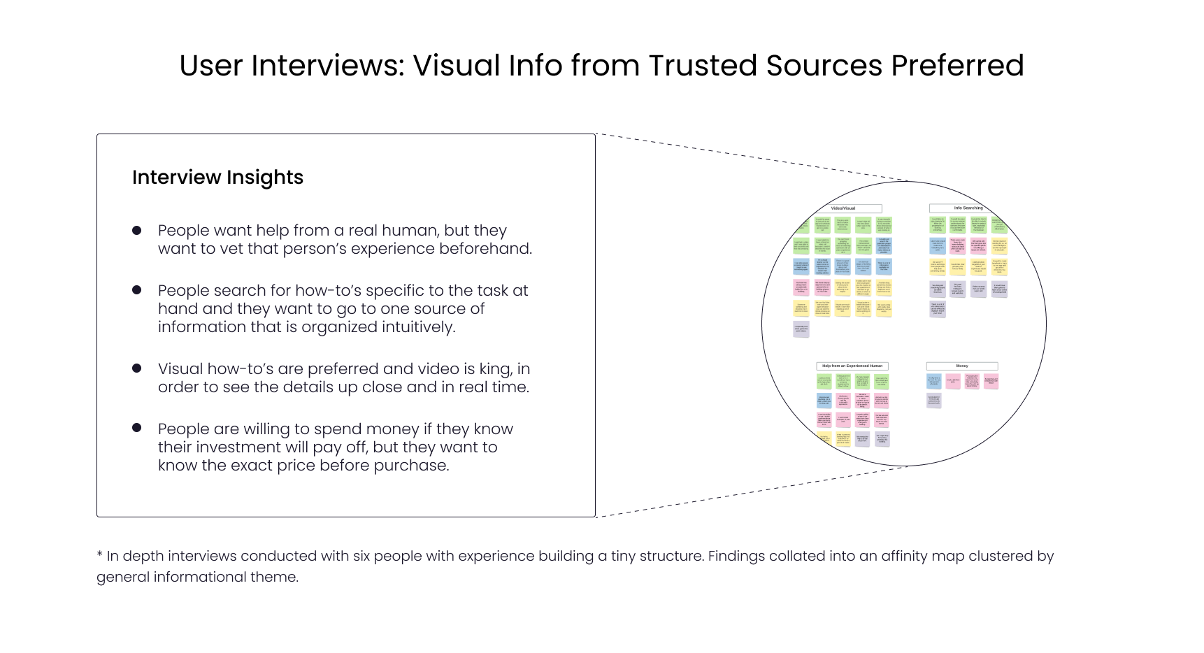
To investigate the needs of my user base, I did a competitive analysis of three current home building related apps, conducted a user survey, and did six in depth user interviews. My analysis showed there are few dedicated resources catering to people interested in building their own tiny home, users seek both online and in person assistance, and video is the preferred online medium.
Insight on User Needs:
In Person Assistance: Users want in-person advice from a trusted source and they want to be able to vet that person’s experience before engaging with them.
1.
Contextual Information: They search for targeted information specific to their project type (van conversion, cabin, etc.) and also by the immediate task they are working on (foundation, plumbing, etc.)
2.
Visual How-To’s: Users prefer visual information over verbal information and video is best. They want to see instructional content up close and in real time.
3.
Ideate
Sitemap: multiple paths for messaging
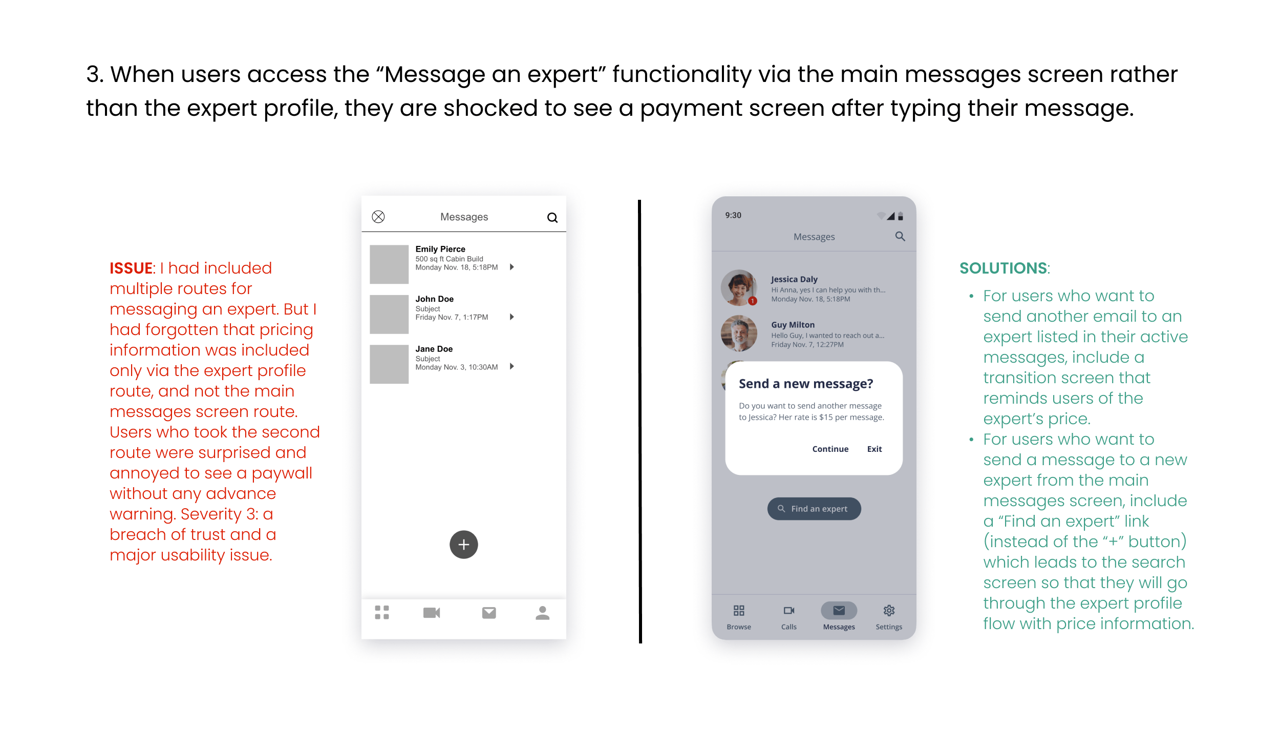
I envisioned an app that would address the user needs my research showed. From the home screen, users can browse or search for experts, view expert profiles, schedule video calls, message an expert, or access settings. A card sort exercise with 8 participants validated my site architecture. But for the “Message an expert” item, participants were torn between the Experts or Messages categories. I opted to make this action available from both the Profile and the Messages screens.
THE APPROACH
Mid Fidelity Design
In person advice from a trusted source
I created a clickable mid-fidelity prototype for my app’s major functionality. Users can find an actual human with tiny home expertise, learn about that person’s experience on their profile page, and message them with questions.
THE APPROACH
Information pertinent to a specific project and task
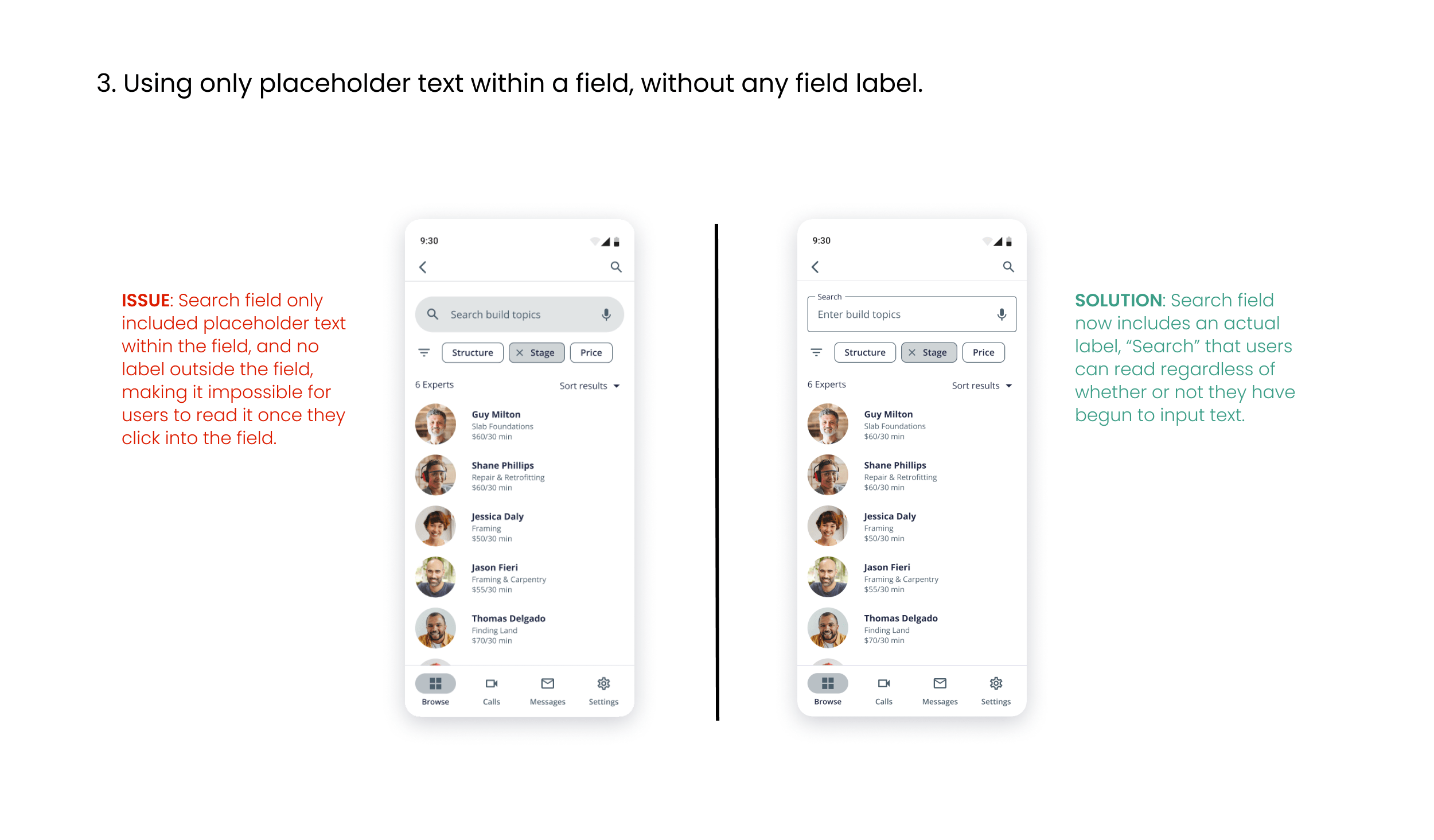
Users can search for an expert by structure type, the task or phase they are working on, and consulting rate.
THE APPROACH
Visual how-to instructional content
Users can connect with an expert face to face in a video call and view real time how-to demonstrations or use screenshare technology to share documentation like blueprints.
THE APPROACH
Usability Testing
Issues found with key functionality
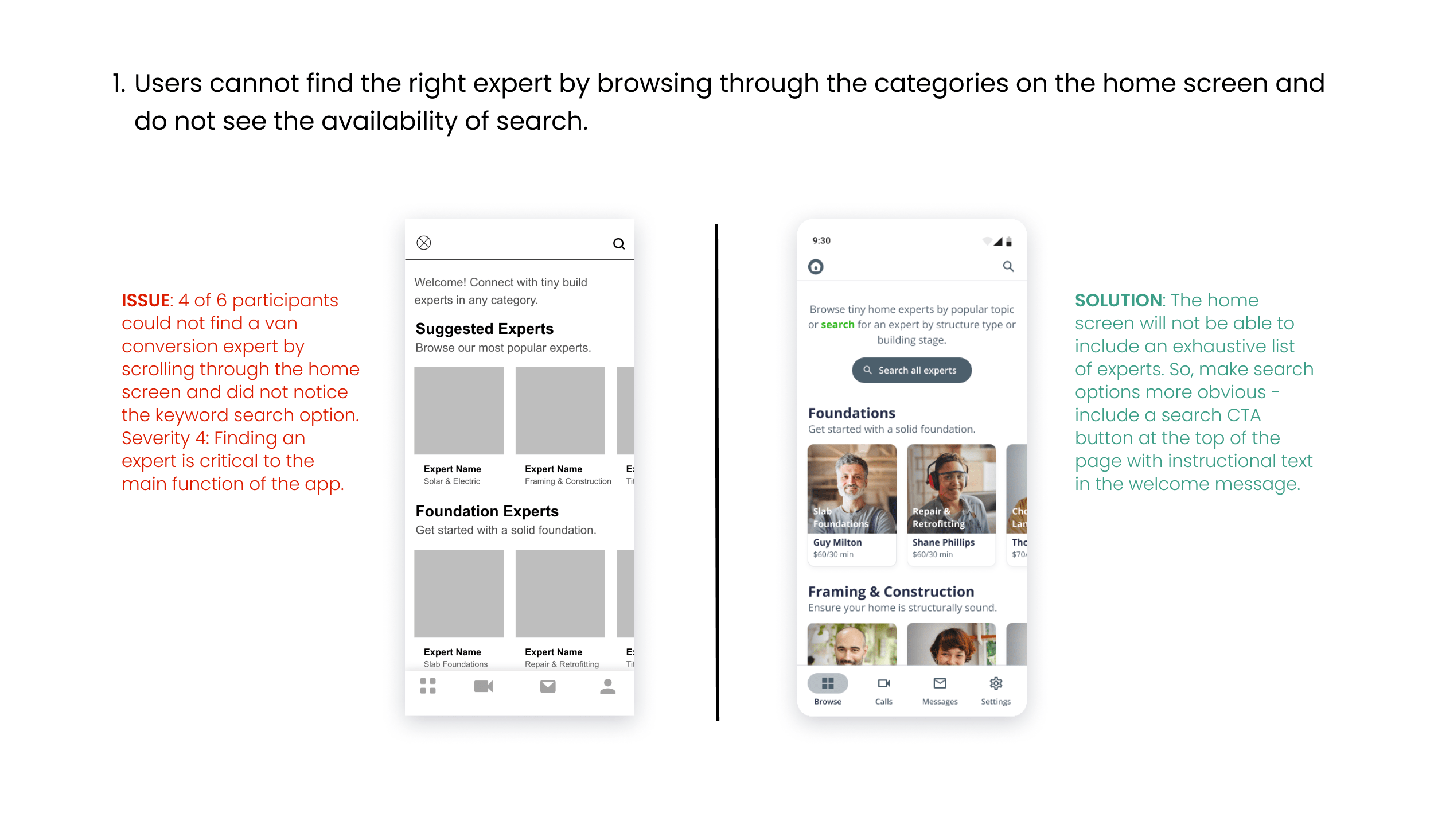
I conducted six moderated in person usability test sessions. Users were prompted with scenario based tasks and asked to think aloud as they worked through them. Testing revealed major issues with almost all of the main features of the app. Users were able to create an account but the success stopped there. They were unable to find experts specific to their hypothetical tasks, they did not notice that search and filter were an option, and they had issues with messaging and joining a video call.
Iterate
Test-based updates and high fidelity elements
In my next iteration, I made updates to address the main user issues found with finding the right expert, messaging them, and booking a call with them. I also included high fidelity elements like images and color in this iteration.
Accessibility updates
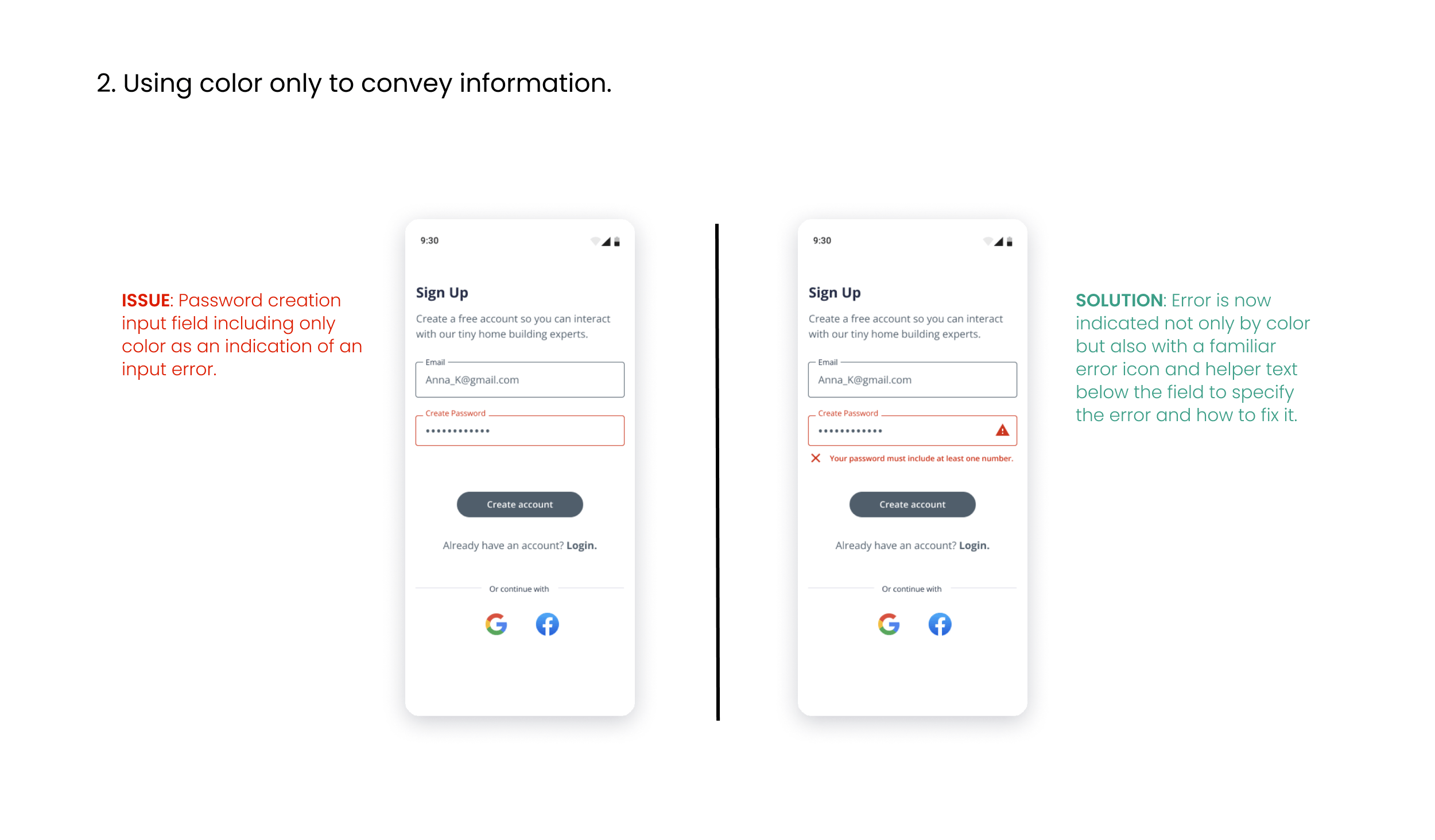
After solutioning for usability issues and adding high fidelity elements, I completed one more iteration to bring the design into compliance with WCAG 2.0 accessibility guidelines.
High Fidelity Design
Straightforward, simple, and clear UI
The approach for the high fidelity design was to inspire a sense of trust and transparency so that users can use the site with peace of mind. Cool grays and greens make up the base of the color scheme and suggest a palette associated with modern housing materials and natural surroundings. The tone is friendly, open, and helpful. See design system.
ONBOARDING:
FIND AN EXPERT:
SCHEDULE A VIDEO CALL:
JOIN A VIDEO CALL:
SEND A MESSAGE:
Key Takeaways
This project required me to keep from jumping to conclusions and be open to continuous learning throughout the design process. The major functionality issues I uncovered during usability testing forced me to slow down and try to understand how users experience an app at the micro level. I realized how much the details matter and that it’s important to be flexible at every point in the process and allow for course correction.
Next Steps
The next key step would be to conduct another round of usability testing on my improved designs to validate my solutions as well as get user feedback on my UI style choices. I would also like to research additional features that may increase user engagement, like user ratings/reviews of experts, blog posts, and curated how-to videos. I believe these features have the potential to build community and make the app a little more dynamic, and I would like to find out if users agree.
Need a UX designer?


